
The mark and the wordmark. White on dark, black on light, and nothing else.
Affinity source files stay out of the repo, in TTS Logo/Logo New. The SVGs here wrap high-resolution images, so ask for the source file when a printer needs true vectors.
The logo
The full lockup wherever there is room. The mark alone only where the name is already present or space is square: avatars, favicons, app icons.


Document running heads, email signatures, anything printed on white.


Transparent, white or black.


Square for app icons and square profile photos. Round has extra margin so a circular crop never clips the mark.
Banners
Profile headers, sized for LinkedIn. Plain black, or with the light streaks from the site.






Usage
A few rules keep it recognizable everywhere.
Clear space
At least the width of the mark on every side. Nothing enters that space: no text, edges or other logos.
Minimum size
Wordmark at least 120px wide on screen, 1in in print. Below that, use the mark alone, down to 16px.
Color
White on dark grounds, black on light ones. Never another color, a gradient, or a tint.
Sizes we use
Site nav: 208px to 448px wide. Document covers: 3.75in wide. Document running heads: 0.2in tall. Email: 200px wide.
Never
Stretch or squash it, rotate it, add shadows or outlines, rebuild the name in another typeface, or set it over a busy photo without a dark ground behind it.
Black, white and grey. One typeface. Hierarchy comes from scale and space, so every page reads calm and deliberate.
Source of truth: src/styles/tokens.css, src/styles/base.css and CLAUDE.md in the repo.
Principles
Color and weight are both off the table, so hierarchy rests on five moves.
Air separates
Space is the primary divider. Hairlines are kept for list rules, the deck grid and form fields; sections carry no borders.
Extreme scale jumps
Display type sits against small uppercase meta. The ratio does the work, never the weight.
Reach the edge
Photographs and list rules run off the page edge. Copy never does; it keeps the gutter.
Asymmetric splits
Two columns run 1.45 to 1, never half and half. Content blocks are never centred.
Generous rhythm
Bands breathe. The space is the premium signal.
Never
Hue of any kind. Cards or rounded containers. A marquee or ticker. Shaped or clipped photography. Numbered steps.
Color
A ramp of near-blacks for surfaces, white at three strengths for type, and white hairlines. Ratios are against the page.
Ink 0--ink-0 #000000
Inverted-band text, deepest wells.
Ink 1--ink-1 #0a0a0b
The page.
Ink 2--ink-2 #121213
Surfaces and form fields.
Ink 3--ink-3 #1a1a1c
Raised surfaces.
Ink 4--ink-4 #26262a
Strong dividers.
Foreground--fg #ffffff
Headings and primary text. 19.8:1
Foreground 2--fg-2 80%
Body copy. 12.6:1
Foreground 3--fg-3 50%
Meta and captions. 5.33:1, and never lower: 45% lands exactly on the AA line.
Lines--line 12%, --line-2 20%
Decorative hairlines, and the ghost button border.
Strong line--line-strong 32%
Edges a person has to find, like form fields. About 3.1:1.
Type
Inter Tight only, self-hosted. Weights 400, 500 and 600, with 700 kept for the all-caps h3. Headings run open, not tight.
The Future Is Built Together.
42 to 80px, 600, tracking 0.015em, line 1.08
What We Build
34 to 56px, 600, tracking 0.03em, line 1.18
Marketing Automation
22 to 28px, 700, all caps, tracking 0.06em. Two or three words only; sentences never shout.
Empowering the Independent Visionaries Who Shape Our World.
24 to 32px, 400. The second half of the headline, off the heading scale on purpose.
We build the systems that handle the busy work, so you stay focused on the work only you can do.
18px, 400, line 1.7. Never below 16px.
13px, 600, all caps, tracking 0.15em. Labels, eyebrows, buttons.
Components
One button language, used as a pair. Fields keep a 3:1 edge so they can be found.
Solid and ghost, 2px radius, uppercase meta. Emphasis alternates between the two after each section.
Ink 2 fill, strong line edge, white edge on focus. Keyboard focus keeps the ring.
Motion
Quick and quiet: 0.2s color changes, no entrance choreography. Everything honors reduced motion.
Proposals, scopes, reports and invoices use the same system set for paper: a dark cover, ink on white inside, and the same restraint.
Downloads
One set per version.
PDFs are generated with npm run release right before each version deploys. Older versions are in the version history. Sources live in templates/documents, with notes in its README.md.
The proposal, page by page
Six to eight pages including the cover and a one-page outline, then pricing and signatures on their own page. Optional pages drop out cleanly.
The invoice
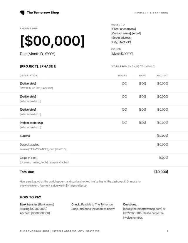
One page in the same system. You type the hours and rates; the amounts, the subtotal, the total due and the large figure at the top are calculated, so they always agree.
Hours invoice
A line per deliverable with who worked on it, hours times one rate. Deposit applied and costs at cost sit below the subtotal.
Deposit invoice
One fixed line, such as 20% of the estimate. The notes at the top of the template show the swap.
Numbering
TTS-YYYY-NNN, sequential across all clients.
Payment
Bank transfer, check, and who to ask. Account details never go in anything published.
Make a proposal
Copy, fill, render, check. The render step catches the mistakes that are easy to miss.
- Copy the folder next to the client’s files, keeping the stylesheet, script and assets beside the HTML.
cp -R templates/documents ~/Desktop/Client/Proposal - Fill it in. Replace every bracketed placeholder and delete the optional pages you do not need. Open it in a browser to see the pages; one that overflows gets a dashed outline.
- Render from the repo. The PDF lands next to the HTML.
npm run doc -- ~/Desktop/Client/Proposal/proposal.html - Read the report. Overflow, em dashes and placeholders should all say none. It exits with an error on overflow or an em dash.
- Renumber the folios if pages came or went, render again, and send the PDF.
Structure
Each page has one job. Say a thing once: the outline summarises, pages detail, the plan owns the dates.
Cover
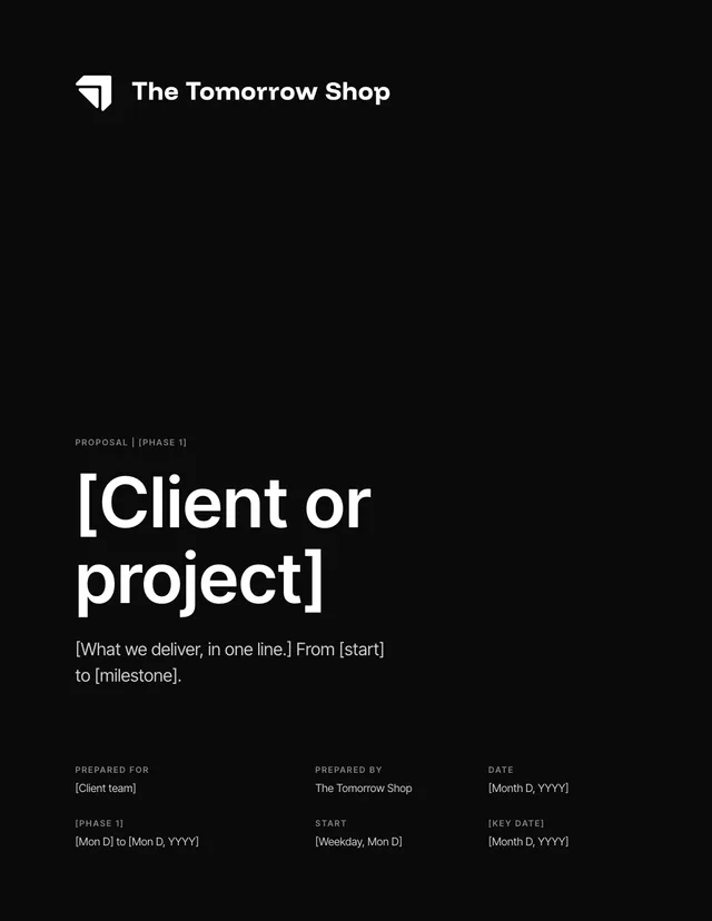
Client or project as the title, one line on what and when, six facts.
At a glance
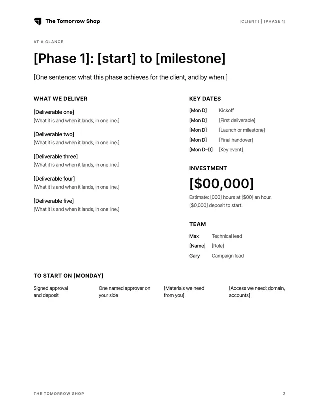
The whole proposal on one page: deliverables, key dates, the investment, the team and what we need to start.
Deliverable
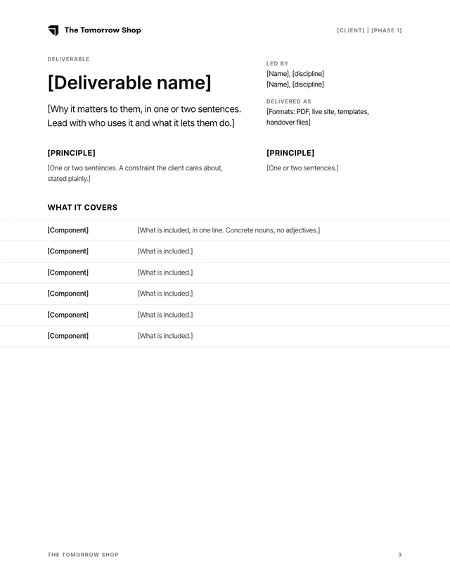
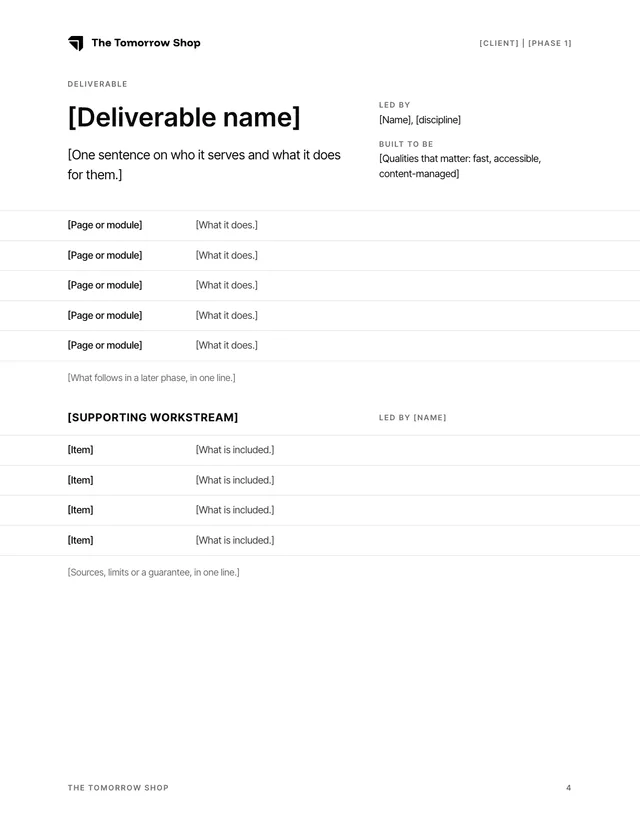
One page per major deliverable. The lead says who it serves; spec rows say exactly what is included. Fold small workstreams into a sub-block.
Plan
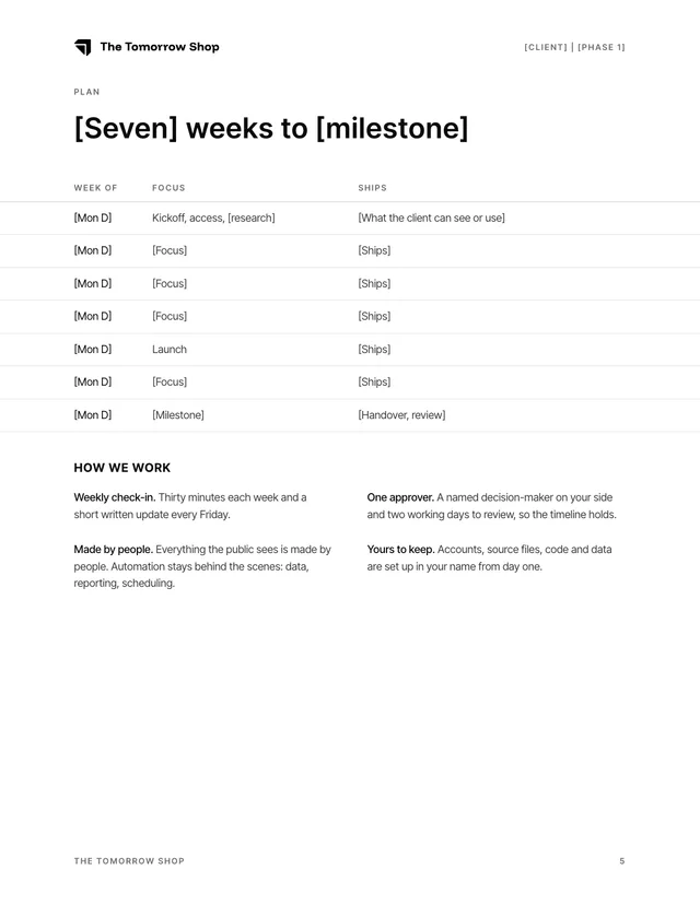
Week by week: focus and what ships. Then how we work.
Success measuresOptional
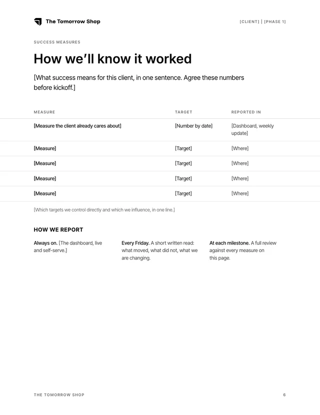
The numbers we agree define success, the targets, and where each is reported.
Beyond this phase
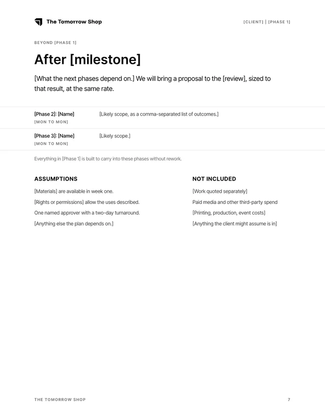
What later phases depend on, then assumptions and what is not included.
OptionsOptional
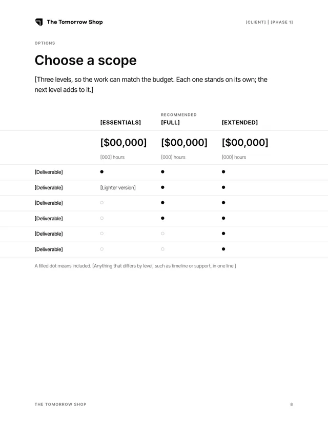
Two or three scope levels side by side. A filled dot means included; one level is marked Recommended.
TermsOptional
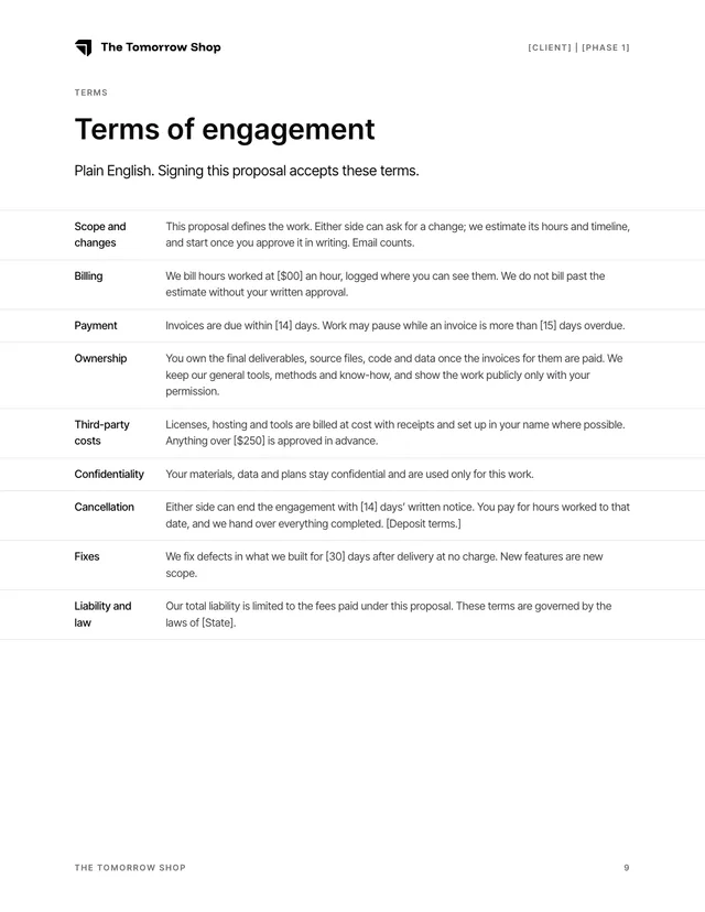
Scope and changes, billing, payment, ownership, costs, confidentiality, cancellation, fixes, liability. Plain English.
Investment and signature
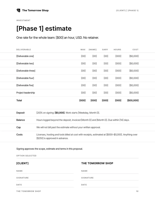
Always last, always its own page. Hours per person per deliverable, deposit, balance, cap, costs, signatures.
On paper
US Letter. The web system inverted to ink on white, with muted text held to the same 5.3:1 margin.
Marketing dashboard
The operating system for the campaign: every contact, every asset and the numbers that matter, in one place.
What it covers
Body sets at 10pt on a 1.6 line, 9.5pt inside tables. Spec rows run to the page edge while the copy keeps the gutter.
Ink#0a0a0b
Headings and key text. 19.8:1
Body#3d3d42
Running text. 10.6:1
Muted#6b6b70
Meta and notes. 5.3:1, never lighter.
Lines12% and 22% ink
Spec rows and signature fields only.
Type
Cover title 60pt, h2 25pt, h3 10.5pt caps, lead 12.5pt, body 10pt, meta 7.25pt caps. Weights as on the site: 400, 500, 600, and 700 for the caps h3.
Page
8.5 by 11in. 0.9in side gutters, 1.05in top, 0.9in bottom. Running head 0.48in from the top with the wordmark 0.2in tall, folio 0.46in from the bottom, no rules between them and the page.
Cover
The site’s page color, the white wordmark 3.75in wide, title at 60pt near the bottom third, six facts in a 1.45 to 1 to 1 grid.
Rules
What keeps every document looking like it came from the same place.
- Short and declarative, in the second person. Lead with what the client gets.
- No em dashes, anywhere. En dashes only in ranges.
- US spelling and dates, USD.
- Numbers reconcile: hours times rate on every row, totals that add up.
- Nothing out of place: no vendor quotes or other clients’ names in a document they do not belong to.
- Monochrome. No client colors or imagery.
- No cards, boxes, shadows or rounded containers.
- Nothing centred; splits run 1.45 to 1.
- Every page fits. The render check says so.
Two options, for Max, Gary and the shared inbox. Plain HTML tables with inline styles, so they hold up in Gmail, Apple Mail and Outlook.
The logo and icons load from Backstage, at /style-guide/signature/, so they never travel as attachments.
You are on a preview address. Copy signatures from backstage.thetomorrowshop.com so their images point at the permanent one.
Option A
The mark beside the text.
hello@
Gary
Max

|
{{NAME}}
{{TITLELINE}}
Phone: {{PHONE}} | Web: thetomorrowshop.com


|
Option B
The wordmark above the text.
hello@
Gary
Max

|
|
{{NAME}}
{{TITLELINE}}
Phone: {{PHONE}} | Web: thetomorrowshop.com
|
|
|
Installing
Copy, paste, save. Set it as the default for new mail and replies.
- Click Copy signature under the version you want.
- Gmail: Settings, See all settings, General, Signature, Create new. Paste into the box and save changes.
- Apple Mail: Settings, Signatures, add one and paste. Untick “Always match my default message font”.
Gmail sometimes asks first-time recipients to download images. That is normal for any hosted signature.